Skin tone mismatch after a face swap: diagnose the cause, then fix it
A swapped face that looks patchy, too warm, or pasted on rarely needs the fix people reach for first. The face and body came from photos with different tones, lighting, or color casts, and each of those is a separate problem with its own repair. So diagnose before editing. Decide whether you are looking at a global color cast, a seam at the jaw, shadows falling the wrong way, or an AI tool that misread the skin. Then apply the one fix that matches. Guess wrong, like running Match Color on a Smart Object, and nothing changes.
Why skin tone mismatch happens in face swap photos
Human eyes read skin tone with unusual precision. Even a small mismatch breaks the illusion and leaves the result looking patchy or ghostly, which is why a swap that seems close on first glance still feels off. MagicCanvas points to the same sensitivity in its breakdown of unnatural face swaps.
Most tools replace only the face region. The neck, ears, and body keep their original color, so a visible seam appears wherever the new face ends, usually along the jaw. media.io describes this as the structural reason face and neck drift apart in tone.
Lighting is its own problem. A color cast and a lighting-direction mismatch look similar at a glance, yet they need different fixes, and treating one as the other wastes effort. Five root causes cover almost every case:
- Color or undertone cast, where the whole face reads warmer, cooler, lighter, or darker than the body.
- Lighting direction and shadow mismatch.
- A face-to-neck seam sitting right at the jaw.
- Photoshop Match Color failing, often greyed out before you can even click it.
- AI tools misreading the undertone because the upload was filtered or blurry.
Step 1: Identify your root cause before editing
Run a quick triage before you touch a slider. Look at both photos and find the light source in each: its direction and whether it falls soft or harsh.
Then compare brightness and contrast between the two images. If one looks washed out and the other crisp, that gap is lighting, not color. For the color itself, decide which direction the face needs to move relative to the body: warmer with more red and yellow, or cooler with more blue and green.
- Find the light source in each photo: left, right, or behind, soft or harsh.
- Compare brightness and contrast; a washed-out face on a sharp body means a lighting problem, not a cast.
- Decide which way the face must move, warmer toward red and yellow or cooler toward blue and green.
- Zoom to the jaw. A seam only there points to face-to-neck discontinuity rather than a global cast.
- Ask whether the source carried an Instagram or Snapchat filter that skews AI undertone reading.
- Check head tilt, because even perfect color looks wrong at the wrong angle.
Fix 1: Correct a color or undertone cast
Start by masking the skin in Photoshop so your color changes touch only the face and neck, not the background or hair. The Adobe community is firm on this: an unmasked adjustment shifts the whole frame and creates new problems.
With the mask in place, open Curves or Levels and work the Red, Green, and Blue channels one at a time. To neutralize a cast, push toward its complement: add cyan to cancel a red cast, add yellow to cancel a blue one. Channel control is what lets you balance a face that a single slider cannot.
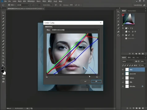
Why bother with all that instead of Match Color? One Adobe Community Expert calls Match Color worthless for serious work and points to manual channel adjustment as the method that actually holds up, a view echoed across the Adobe Community thread on stubborn skin tones.
Prefer an AI editor? Many expose simple highlights and shadows controls that warm up or cool down skin without channel work, which is enough when the cast is mild.
Fix 2: Unlock Match Color when it is greyed out
Match Color sits greyed out because your target layer is a Smart Object, and the tool only runs on a flat pixel layer. The Smart Object badge on the layer thumbnail is the tell.
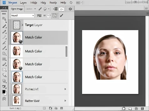
The fix takes one step. Right-click the layer in the Layers panel, choose Rasterize Layer, and Match Color turns active under Image > Adjustments > Match Color.
One caveat. Even after rasterizing, Match Color sometimes produces no visible change at all. When that happens, drop back to the channel-by-channel Curves method from the previous fix. Behavior also shifts between Photoshop CC versions, so confirm what your installed version actually does rather than trusting an old tutorial.
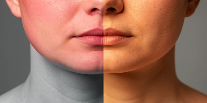
Fix 3: Correct face-to-neck color discontinuity
This seam exists for a mechanical reason: the swap replaced your face but left the neck and body at their original color. So the boundary at the jaw is where two different skin tones meet, not a flaw in your editing.
Correct it by adjusting face and neck together rather than the face alone. An AI skin tone editor such as the media.io AI skin tone changer can even out the boundary while keeping original skin texture, then soften the transition with its blending or feathering controls. Go easy: heavy smoothing trades the seam for a plastic, poreless look.
Fix 4: Correct lighting direction and shadow mismatch
Sometimes the color is right and the photo still looks wrong. A face lit from the left dropped onto a body lit from the right reveals the composite no matter how well the tones match, because the shadows disagree.
Fix it by working highlights and shadows separately, never with one brightness slider. Nudge the shadow levels on the swapped face until they fall in the same direction as the shadows on the body and in the background.
The cleaner route is prevention: pick a source and a target that were lit from the same side in the first place, and most of this work disappears.
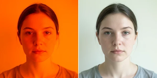
Fix 5: Fix AI tool skin tone errors from filters or low image quality
AI skin tone tools read actual pixel color values, so a heavy Instagram or Snapchat filter feeds them the wrong data and the undertone analysis comes back wrong. Strip the filter before you upload. pixelbin.io flags filtered input as a common cause of bad automatic correction.
Image quality matters just as much. Blur and harsh directional shadows distort the color values the model samples, so feed it a sharp photo shot in soft, even light, with a plain background and the subject facing the camera.
Most AI correction tools take a text prompt. Instead of fighting sliders, describe the target directly: 'warm tan', 'healthy wheat color', or 'deep bronze glow' steer the adjustment far more reliably than automatic detection alone, as media.io shows.
Whatever the tool returns, judge it close up. Check that the texture survived, pores and shadows included, and that the face does not read as over-smoothed. A too-perfect result is its own giveaway.
Quick prevention checklist: choose better source photos
Better source photos mean less correction later. Before the next swap, line these up:
- Match lighting direction and intensity between the two photos before you swap.
- Feed AI tools sharp, unfiltered images.
- Keep head angles close; a small tilt difference compounds every later correction.
- Bring brightness and contrast into the same range before swapping.
- Hold back on softening so pores and natural texture survive the edit.